Budget reports! Budget reports! Long live, budget reports!
You want to slice and dice your financial data every which way? Check.
You want a high-level view of how you’re doing? Done.
You want to get down to the nitty gritty details of a particular category? Woot!
You want colorful graphs and pie charts? Bam. We’ve got you, fam.
Data is an important part of personal finance, which is why the YNAB report functionality is an invaluable budgeting tool. You can track trends, check bank account balances, identify areas of overspending, and visualize your progress.
So, without further ado, here’s how to do all of that and more:
See Your Budget Reports in YNAB
With budget reports, you’ll be able to isolate and focus on the data that is most important to you—and analyze your finances from several different vantage points.
In all three reports, you can filter by category groups, timeframe, and accounts. Just use the filters found at the top of each report screen:
See How Much You Spend on Immediate Obligations
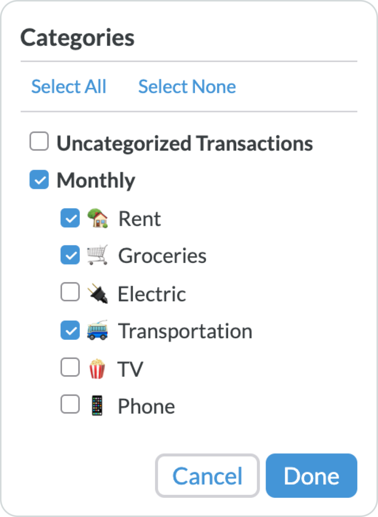
The default view shows all of your budget categories, but if you want to compare specific master categories or even specific subcategories, you can toggle those categories on and off.
You can “Select All” to easily go back to the default view of all categories, or you can “Select None” to start with a blank slate and choose the categories you want to evaluate.
Splice and Dice Data by Dates
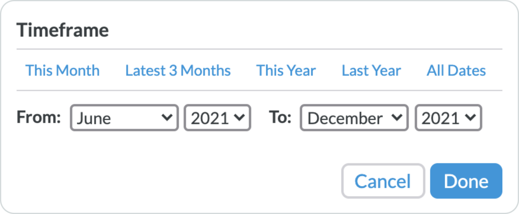
Using the preset filters at the top of the timeframe dropdown, you can toggle between “This Month,” the “Latest 3 Months,” “This Year,” “Last Year,” or “All Dates.” If those presets are too generic, you can enter custom start and end dates in the “From” and “To” fields, to query a specific timeframe.
See the Growth of a Specific Account
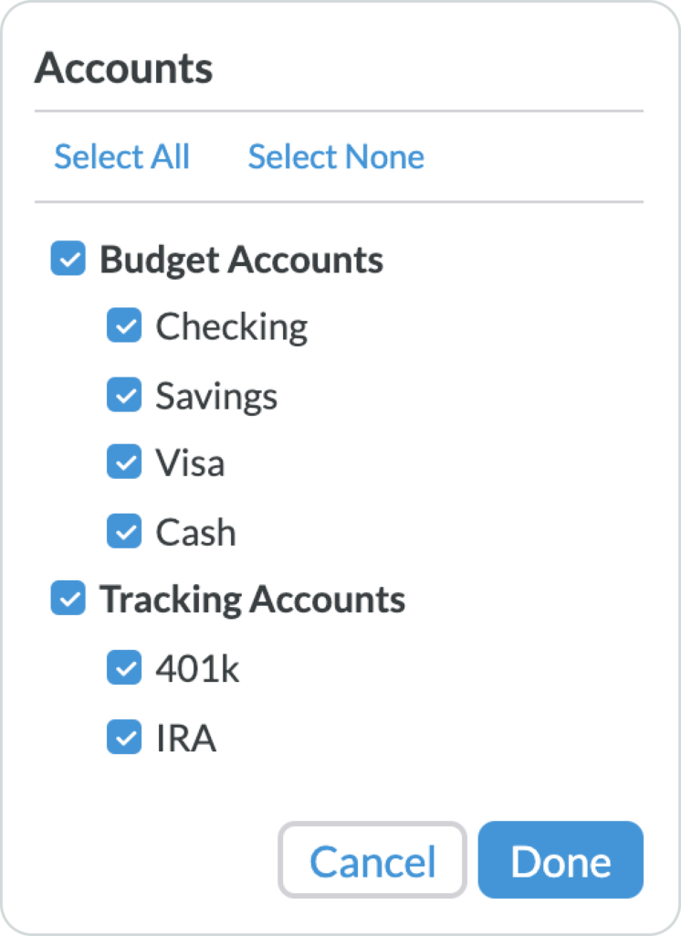
Most people handle unique accounts differently. Maybe you just want to look at your checking account, or you want to see the growth of an investment account that you’ve been tracking.
In the accounts selection dropdown, you can toggle individual accounts on and off or select “Budget Accounts” or “Tracking Accounts.” Easily view all accounts by checking “Select All,” or start with a blank slate by checking “Select None,” and then simply check the accounts that you want to see.
The Spending Report
The Spending Report brings all your spending to life! You can view your spending totals in a pie chart or your spending trends in a bar graph with a simple trendline that shows the data by month.
See Your Spending Broken Down by Category
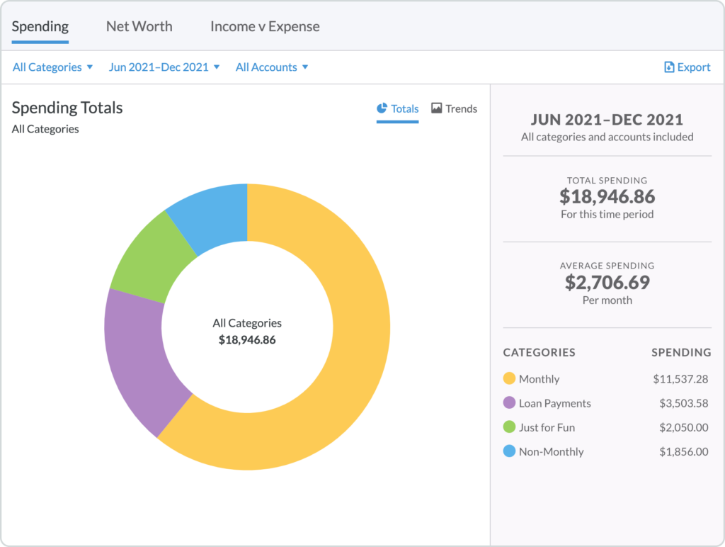
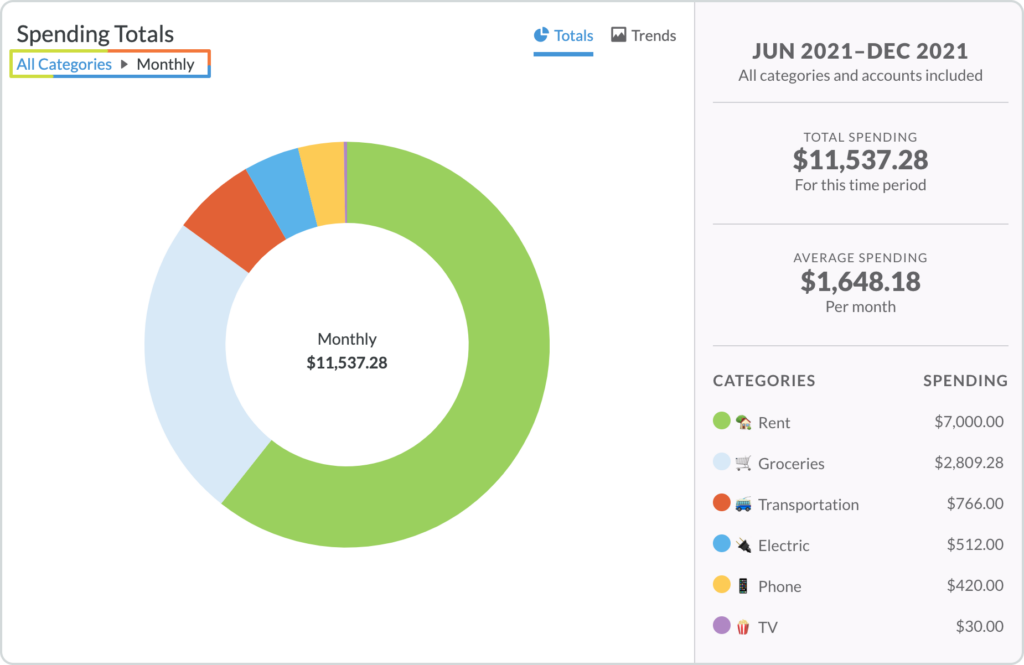
In the Totals section of the Spending Report, you will see a color-coded circle graph showing your spending totals as a percentage of your overall money spent.
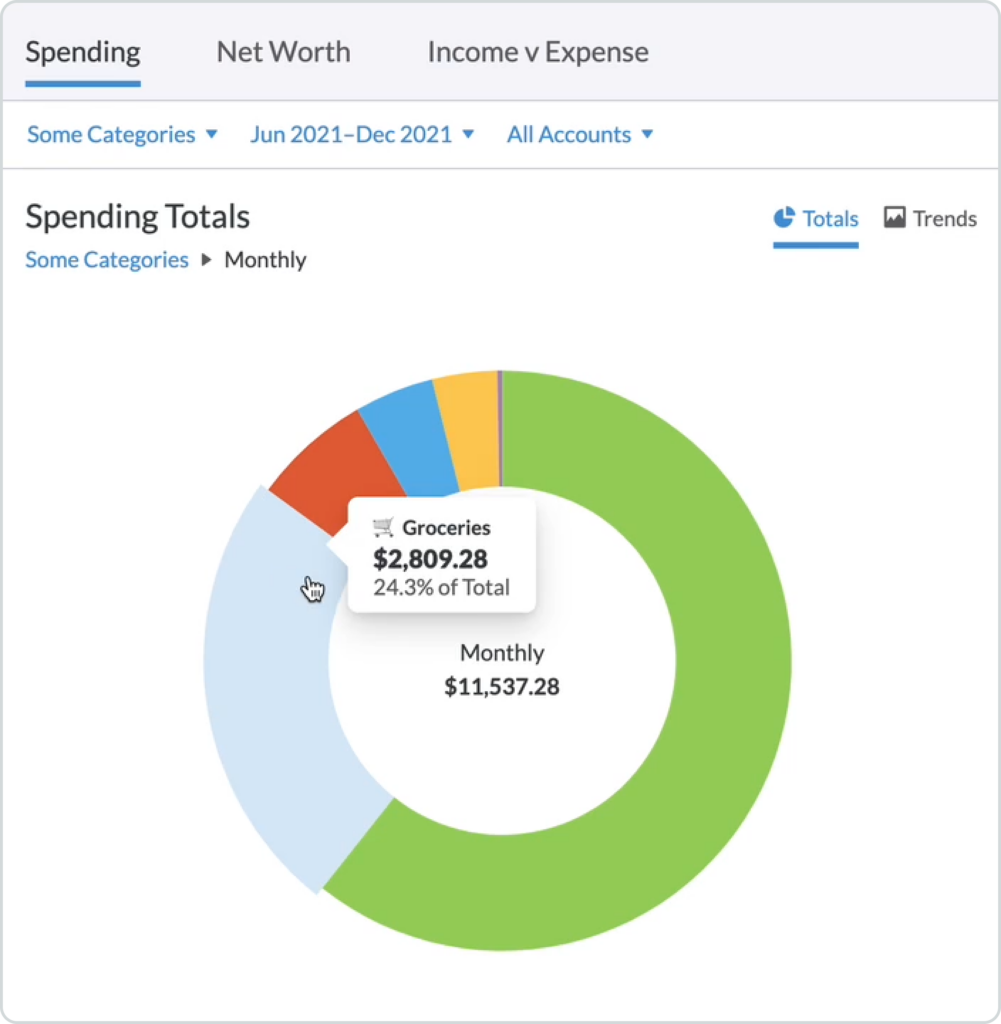
You can hover over each section of the circle graph to see both the total amount spent for each category along with the percentage of the total amount spent. You can also use the legend on the bottom right to determine which color corresponds to which category.
On the right-hand side, you’ll see the timeframe, and which categories and accounts you are currently viewing. You will also see your spending totals and averages for the selected categories.
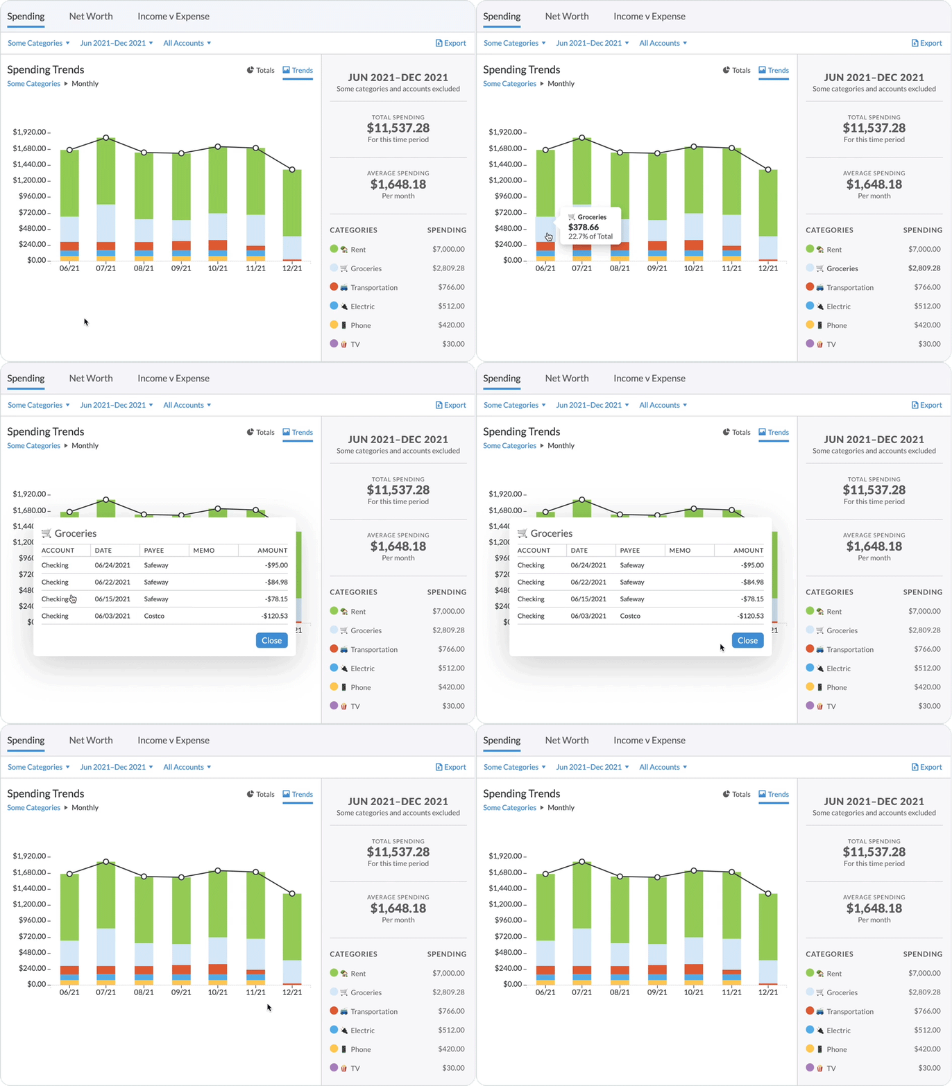
The default view will show you all selected master categories. If you click on a category in the circle graph (or in the legend) you can then drill down into the subcategories of that particular master category. The section on the right will now show you the totals and average for only that master category.
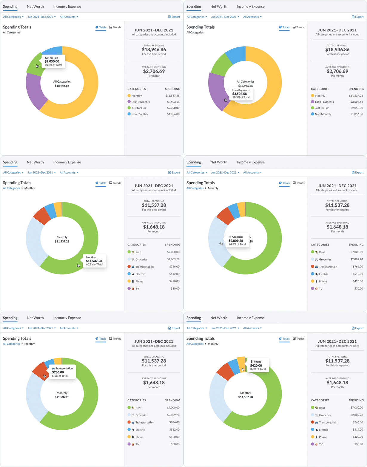
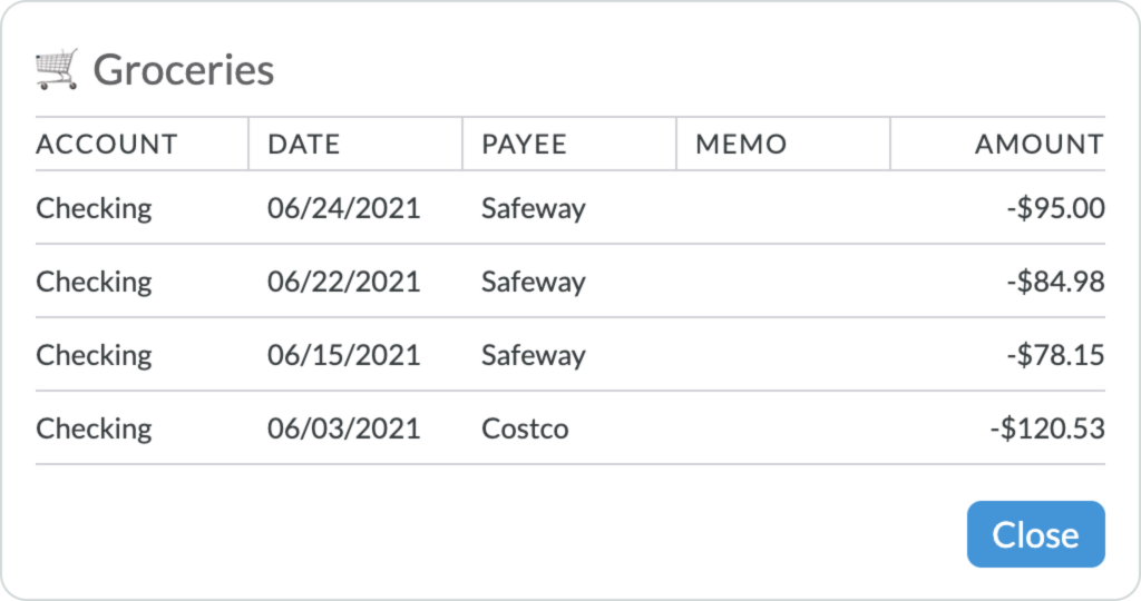
Inside of that master category, you can drill down even further to see all of the transactions tied to a subcategory by clicking on that subcategory in the circle graph or in the legend on the right.
(Watch out, seeing every dollar you spent on groceries can feel a little painful.)
To go back up a level to see all of the master categories, just click on the “All Categories” (or “Some Categories”) link in the breadcrumbs in the top left:
Use Budget Reports to Check Your Lifestyle Creep
To see your spending trends, from month to month and over time, click on the “Trends” button in the upper right corner:
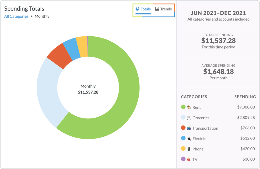
The Trends report is set up in the exact same way as the Totals report. You have your color-coded categories (now in a bar graph) on the left side of the screen and your total, average, and graph legend on the right.
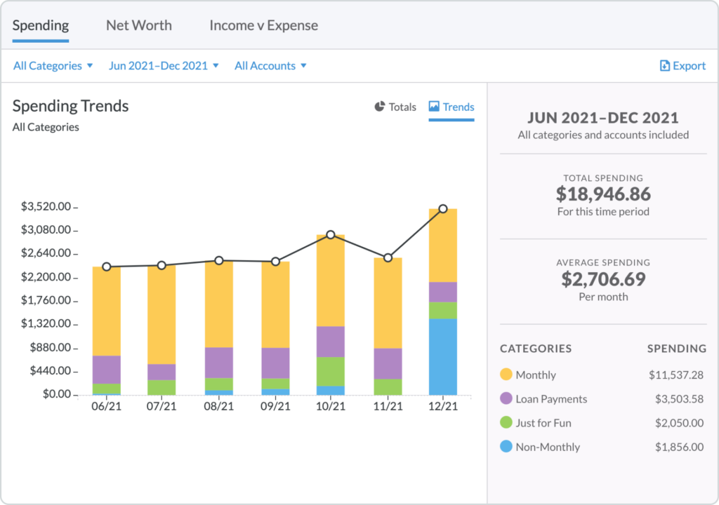
You can hover over each colored category in the bar graph to see the total and percent of the total spent for each month. By clicking on a colored category, you will then drill down into that category to see how much money was spent in each subcategory. As with the Totals report, you can click on each subcategory (in the bar graph or in the legend on the right) to view all transactions tied to that subcategory.
Reports can be…revealing. Check out this video from the Budget Nerds on how get a handle on your impulse spending if you’re inspired to make some changes!
Track Your Net Worth
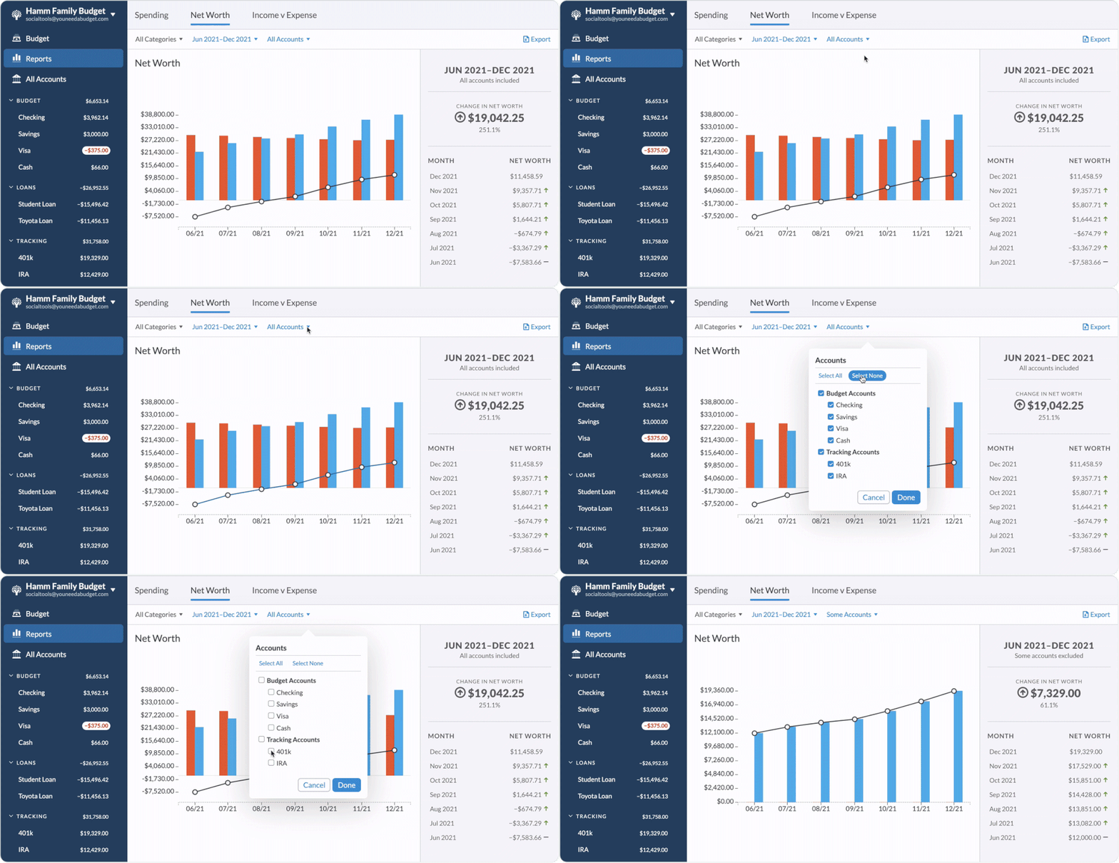
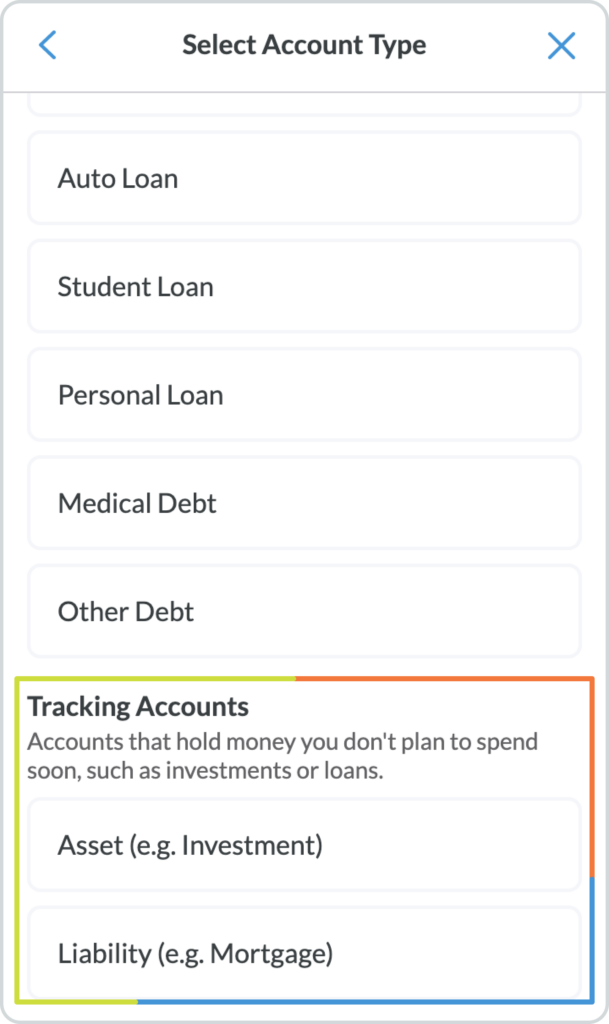
Breaking the paycheck to paycheck cycle is awesome, but building wealth is a close second. The better you budget, the faster your Net Worth graph will climb. Your net worth is determined by subtracting your debt from your assets. This report will hinge a lot on Tracking Accounts for things like mortgages, savings and investment accounts along with your everyday accounts like checking and credit cards.
Your account type is determined when you set up each account. Tracking accounts do not affect your budget, but can help you track liabilities and assets. To get a full picture of your net worth, make sure that you have all assets and liabilities in either tracking or budget accounts:
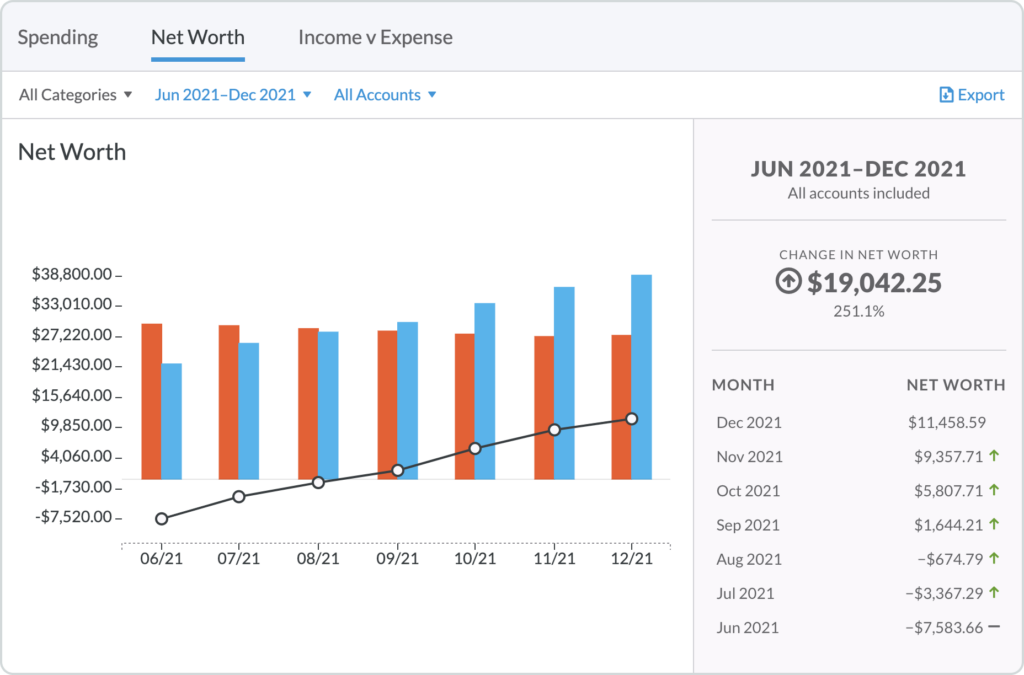
The Net Worth report works rather simply: debts (or negative accounts) are shown in red while assets (or positive accounts) are shown in blue. Hover over each bar (both red and blue) to see the breakdown of your debts, assets, and total net worth for each month.
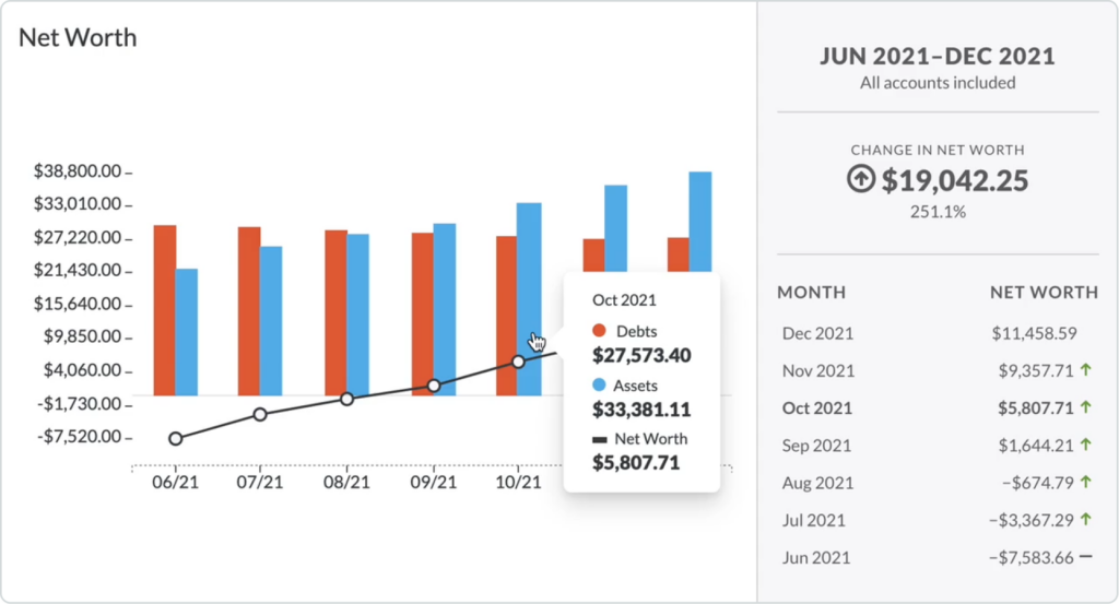
On the right, you will see the timeframe, accounts, and total change in net worth for the selected timeframe. Additionally, you’ll see the itemized month over month change.
See What You Spent vs. What You Made
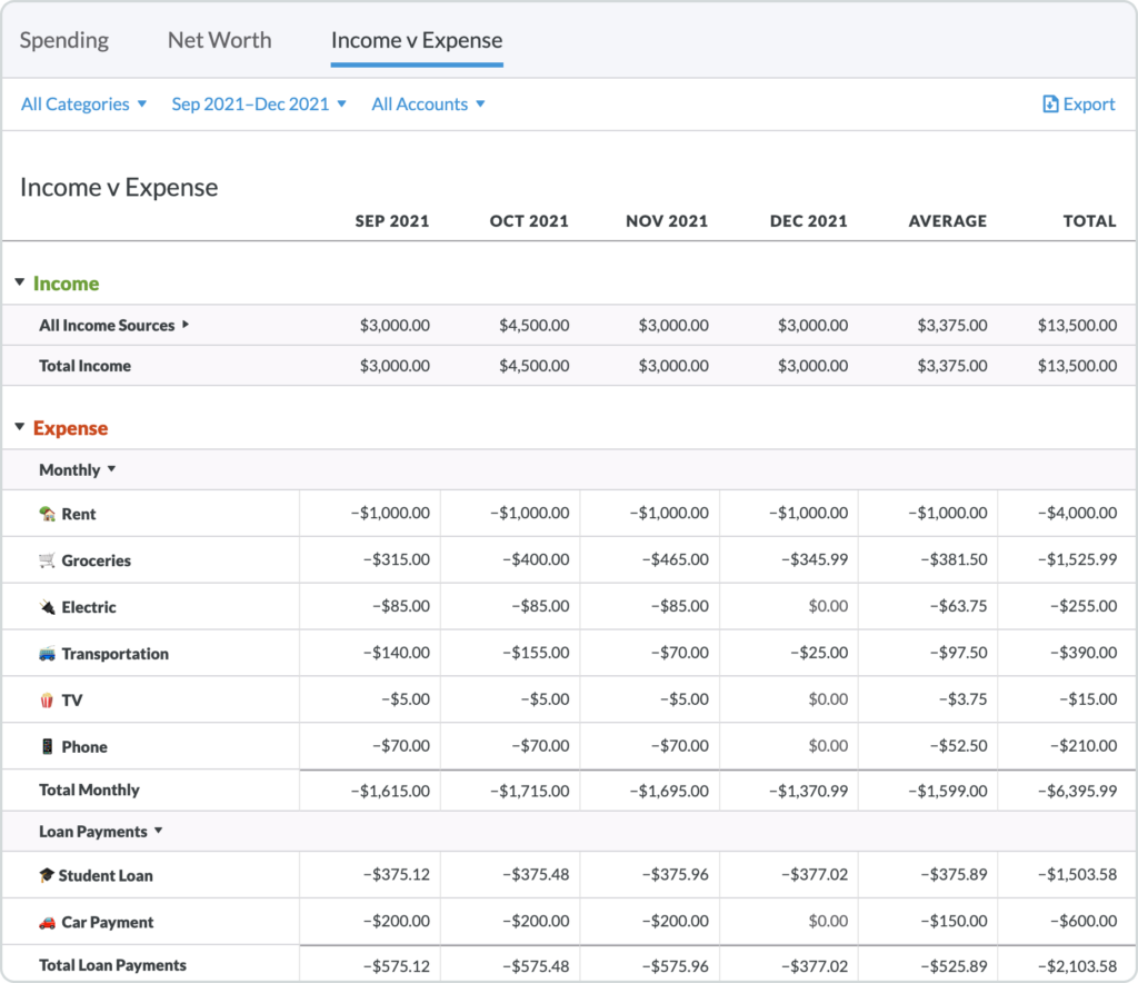
In the Income v Expense report, your income is shown across the top (under the green “Income” heading) while all of your expenses (read: spending) is shown at the bottom (under the red “Expense” heading).
This report maps both your income and expenses month by month along with the averages and totals for each category.
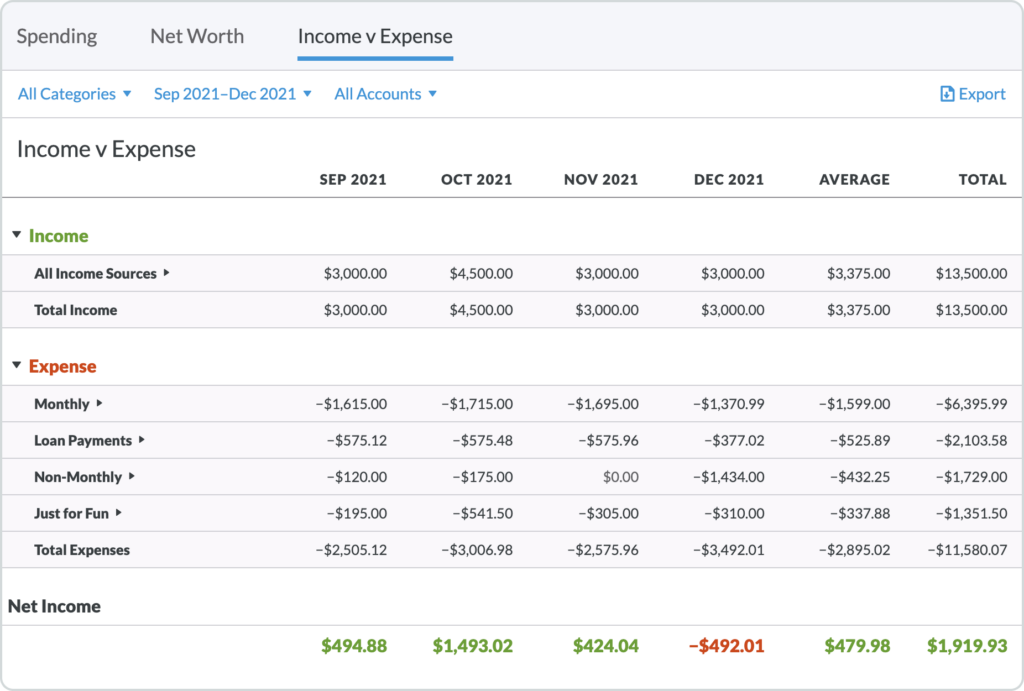
If you want to see subcategories, simply click the arrow to the right of each master category and the subcategories will expand underneath.
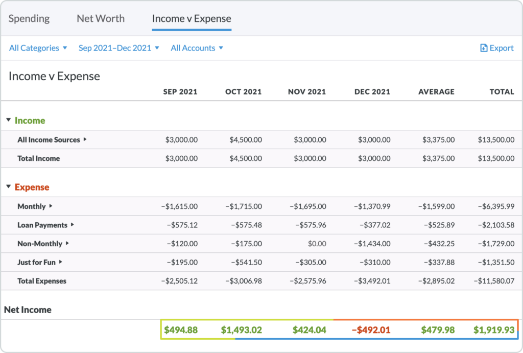
Perhaps the most useful information in the Income v Expense report is seen in the totals at the bottom of each month (along with the overall average and total). Over budget months (hopefully these are rare!) are shown in red while under budget months are green:
So, there you have it: all of your income, spending, assets and liabilities in reports that are easy to filter, manipulate and dissect.
And pretty to look at and share. Dataheads, go crazy! The rest of you, explore a little and see how you can put this information to work to gain even more control of your finances.
Want a weekly dose of bite-sized budgeting tips and tricks? Sign up for the YNAB Weekly Roundup.
This post was originally published in October of 2016. It has been given a mini-makeover to help it maintain its youthful appearance.
Publisher: Source link


